Monday, 25 October 2010

The Sixth Sense poster analysis


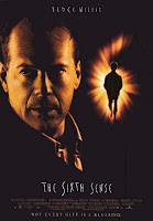
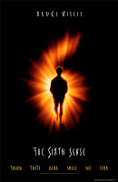
The three posters above are all for the film The Sixth Sense. The first think which is noticeable is how similar these poster are to one another, gives the film almost a house design - like a magazine does with their title. All three posters are very simple yet effective all using very bold black, orange and white colours. This simplicity conveys a typical stereotype of a horror film which is effectively simple and bold.
 The picture of Bruce Willis on the left and right poster is the same. The facts that Willis is looking to the side and not at the camera makes the image seem threatening. The audience is led to believe that he is looking at something which they cannot see which adds to the darkness and mystery of psychological horror. The picture of Willis' face is highlighted in a bright colour which could indicate that there is hope for this character from the darkness that surrounds him. It is also clear that his features are quite rugged which is naturally associated with strength, as well as him being male.
How Willis is portrayed in this poster can be contrasted in the way that the other character in this film, Cole is portrayed. In the left and centre posters it is clear that Cole is a young boy and from the six behind the outlining of the number 6 gives a clue that Cole is the one with the sixth sense. In the same two posters the picture of Cole is filled with darkness which represents how he lives his life. However the bright number 6 which is behind Cole acts as a silver lining, to show that there may be help and hope for Cole yet. The right hand-side poster shows Cole in the same lighting as Willis. However you can clearly see almost a smoke around Cole which becomes that it is his breath. As told in the trailer Cole states that when a ghost is around it becomes cold, this maybe a clue to the twist and plot of the whole film, as well as adding tension to the audience.
The text in the three posters above is very effective to the film. The stars name Bruce Willis is on all three posters, this shows the importance of Willis' name to the film and attracting the right target audience. The left poster uses text which could be used as the films slogan: "Not every gift is a blessing". This ambiguous bold statement adds further confusion to the audience as the sentence is self-contradictory. The centre poster also names the five other senses which the majority of people possess to make the link more noticeable with the sixth sense.
Another thing I also noticed about the lighting of right hand-side poster is the streaming light from the right hand corner of the poster. This light seems to represent the light from heaven, from another world. The fact that Cole is closer to this light gives an idea that Cole is in close contact with another world than Willis.


Tuesday, 19 October 2010

Sixth Sense Trailer


The Sixth Sense is a 1999 film written and directed by M. Night Shyamalan. The film follows the story of Malcolm Crowe (Bruce Willis) a psychologist who receives an award and on the same night is visited by an un-satisfied ex-patient. A year after this encounter Crowe is assigned to a young boy called Cole who seems to be suffering from the same problem as his former ex-patient. Much to the dismay of his wife Crowe begins to spend a lot of time with Cole to try and understand his condition, it soon becomes apparent that Crowe might be Cole's only hope, but what is unrealised is that Cole is also Crowe's only hope.


The Sixth Sense trailer begins with a state of equilibrium, as we get the idea of normal busy city life was an unfortunate incident of a car accident has taken place. This is made clear by an establishing shot of the road zooming out; with diegetic speech from the character Cole talking to his mum explaining what has happened. However once Cole says "Standing next to my window" all  diegetic music stops and the trailer takes a more sinister turn with an eerie soundtrack, which builds tension making the audience drawn in.
The next scene is of a red balloon rising up towards a light. This certain clip is open to ambiguous interpretations. The red balloon can be seen as a lead for Cole towards something from another world. However the balloon can also be a representation of a spirit going up towards the light of heaven. The fact that the clip cuts before the balloon has reached the light gives the idea that these spirits have not yet entered the next world but trapped in this.
There are also a lot of shadows throughout the trailer. This represents the connection between Cole and his mother. Throughout the trailer there are clues given that Cole has an isolated relationship, he remains in the shadows to not draw attention to his mother: "because she doesn’t look at me the way everybody else does and i don't want her to know."
The trailer uses a lot of short clips and cut shots to add to the excitement and fear of the trailer. The clips are connected by very quick fade in fade out shots of black - this help relates to a heart beating fast. Cole is introduced by a lot of high angle shots. This gives the audience the idea that Cole is vulnerable in this movie and fraught with danger. The idea of a child being in danger is typical of a horror film and in particular a Psychological horror. There is also a lot of quick zooms in and zooming out of camera angles, not only to add to the fast pace of the trailer but to also emphasize the idea of "falling down really fast".
There is hardly any text used in the trailer but the basic story is told by Cole to audience as clips of audio from the film are being used as a voice over. The only text used in the film is the name of the main actor "Bruce Willis" and the name of the actual film "Sixth Sense". It is clear from the trailer that this film is a psychological horror; however it is typical of psychological horror to have a twist to the story. The fact that we are told in the trailer that Cole is the boy who possesses the sixth sense and can see dead people, tells the audience that there is another more surprising eerie twist to come.
The colour red is very important in this trailer. Red is usually linked with danger therefore Shyamalan intentionally absents this colour from most of the film; instead the colour is used in isolated shots. As you can see in the trailer the colour red is used for the colour of the balloon, carpet, Cole's sweater, the tent and Cole's mother's hair and sweater. The majority of the colours in the film seemed to be washed out and dim to represent the darkness and evilness of the film.

Sunday, 10 October 2010

Our Chosen Genre

As a group we have decided to base our coursework on a psychological horror. We will make a trailer, poster and front cover in relationship to the psychological horror genre.
Psychological horrors rely on characters fears, guilt, beliefs, eerie sound effects, relevant music and emotional instability to build tension and further the plot. Psychological horror tends to be subtle compared to traditional horror and typically contains less physical harm, as it works mainly on the factors of mentally affecting the audience rather than the display of graphic imagery. In a psychological horror the essential element is to frighten the audience mentally, whereas this is not the case in thrillers.

Examples of psychological horror film are as following:
1408
The Blair Witch Project
The Sixth Sense
The Unborn
The Others
Gothika
The Shinning
Paranormal Activity.

Tuesday, 5 October 2010

Inception Magazine Front Cover Analysis


Both Total Film and Empire magazines are established critics of upcoming new films, as can be seen above, both institutions have done special editions of their magazines for Inception. Equally the magazines have changed their usual house style of their magazines to fit the conventions of architecture. The magazines both focus on washed-out colours contrasted with a striking red, which is associated with danger. DiCaprio is wearing dark colours which emphasize an element of the evil.  The images of DiCaprio have been given a back-lighting which casts an eerie glow around the washed out colours. This gives the idea of a light at the end of a tunnel, as though there is still some hope for DiCaprio in this film.
However there are contrasts within the two magazine covers. The Empire magazine cover uses the puffs to give a tunnel-like image and has given a birds-eye view of a city. This back image gives an idea of a fast-paced movie which has quite confused surroundings. The Total Film magazine cover also uses a bird-eye view of a city, but only for the title changing the house style of the magazine. The background image is actually of a street and DiCaprio standing in the middle of it. The picture is taken from a low angled shot to make DiCaprio seem in control of the situation.